Essential Footfall Analytics Dashboard Features for Data-Driven Success in 2026
According to a 2023 study by the International Council of Shopping Centers, nearly 74% of retail executives admit their organizations collect more data than they can actually use. You likely feel this weight every Monday morning when looking at spreadsheets that show foot traffic spikes but don’t explain why your conversion rate stayed flat. It’s frustrating to watch labor costs climb during quiet hours while your team feels overwhelmed during unpredicted rushes. High-performance footfall analytics dashboard features are designed to solve this specific disconnect by turning noise into clarity.
You’ll discover the critical dashboard features that transform raw visitor data into actionable business intelligence and measurable ROI. We’ll examine the technical requirements for seamless POS integration and the real-time reporting tools necessary to manage 50 or 500 locations with total precision. This article provides a clear roadmap for moving from guesswork to evidence-based growth in the 2026 market.
Key Takeaways
- Transition from simple visitor counting to complex journey mapping to decode human behavior and gain a strategic advantage in the 2026 retail landscape.
- Utilise real-time heatmapping and zone analytics to identify high-traffic “hot spots,” allowing for data-driven decisions on floor layout and product placement.
- Identify the critical footfall analytics dashboard features that integrate POS and weather data to reveal your true sales conversion rates regardless of external factors.
- Optimise operational efficiency by aligning staff rosters with predicted traffic peaks, reducing wage wastage while maintaining high service standards.
- Streamline stakeholder communication through automated, customisable reports that transform complex sensor data into clear, actionable business intelligence.
The Evolution of Footfall Analytics: Why Dashboard Features Matter in 2026
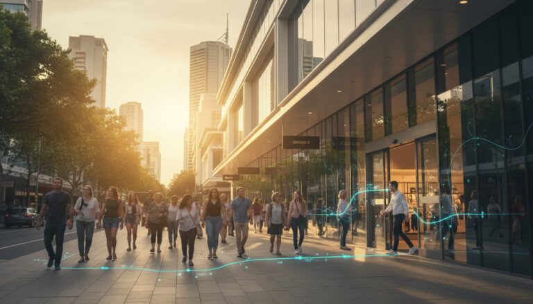
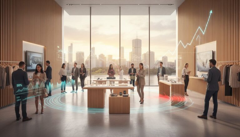
The modern retail environment has transformed the humble door counter into a sophisticated command center. By 2026, the standard for success relies on a real-time business intelligence hub rather than historical logs. Static weekly reports no longer suffice in a market where consumer behavior shifts by the hour. Leading organizations now prioritize footfall analytics dashboard features that provide a deep dive into visitor journey mapping, moving beyond basic “in-and-out” metrics to understand how people interact with physical spaces.
This evolution starts at the edge. High-precision sensors like the FootfallCam Pro2 serve as the critical data source, feeding granular information into the dashboard. These devices utilize advanced people counting technologies to ensure that every strategic move is backed by empirical evidence. Modern systems translate these signals into heatmaps and flow charts, allowing owners to see exactly where engagement peaks and where it falters. This shift represents a move from passive observation to active operational optimization.
Data Accuracy vs. Data Intelligence
Raw numbers mean little without context. A 98% accuracy rate acts as the non-negotiable baseline for credible reporting in 2026. High-tier footfall analytics dashboard features use AI filtering to cleanse data at the source. This process automatically excludes staff members, security personnel, and children from the final count. It ensures that the user interface reflects genuine customer intent. Cleaning the data before it reaches the dashboard allows managers to base labor costs and marketing spend on actual buyers rather than background noise. Precision at the sensor level is what transforms a simple chart into a strategic asset.
The Cost of “Blind” Operations
Operating without real-time traffic visibility creates significant financial risk. Retailers using feature-poor dashboards often miss sales opportunities during unexpected peak periods because they lack the agility to redeploy staff. Poor data visualization also erodes executive-level buy-in. When a dashboard fails to translate complex spatial analytics into clear, actionable insights, leadership often defaults to guesswork. In a 2026 economy, that lack of precision leads to measurable decreases in operational efficiency. Without a clear window into store performance, businesses remain reactive, struggling to keep pace with competitors who optimize their floors in real time.
- Real-time visibility: Enables immediate staffing adjustments to maintain service levels.
- Visual clarity: Simplifies complex data so stakeholders can make decisions in seconds.
- Strategic intent: Focuses on high-value traffic rather than raw volume.
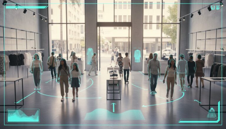
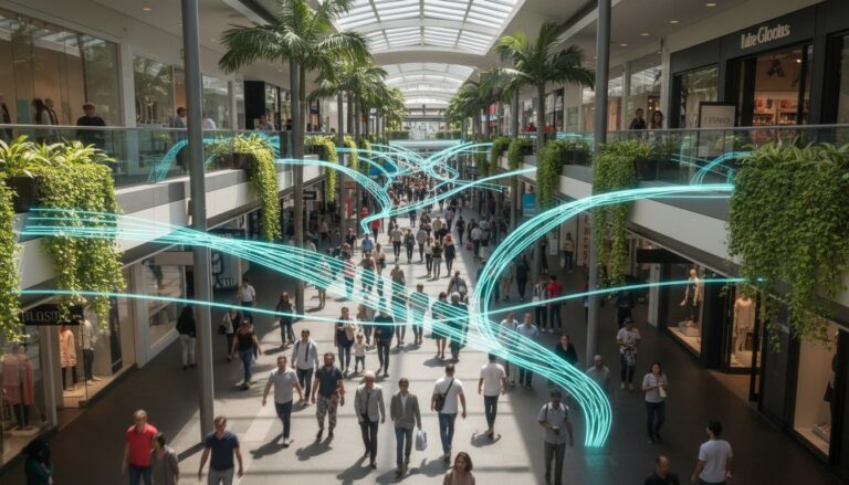
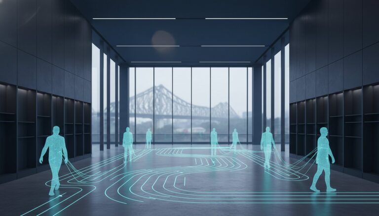
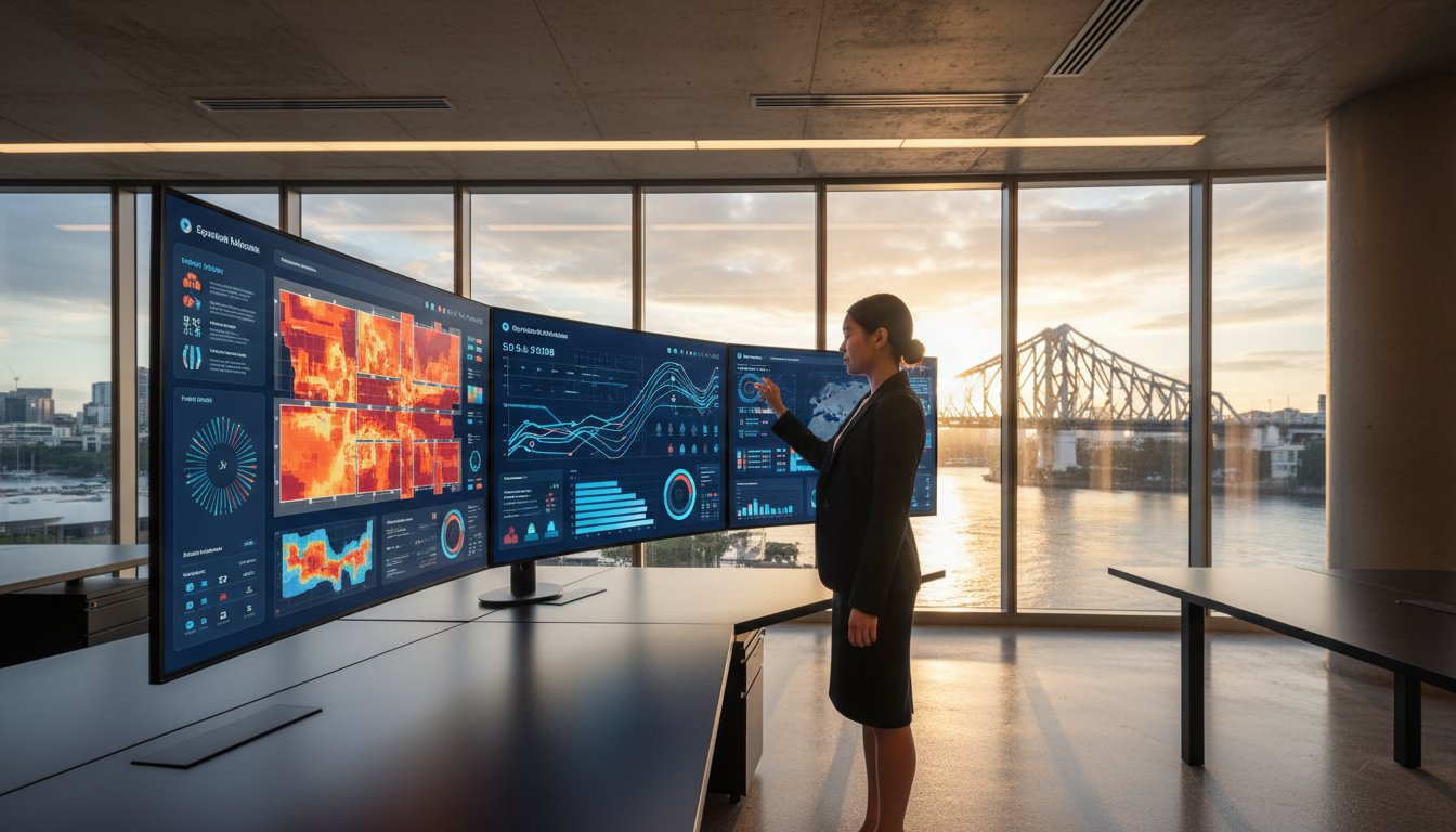
Core Visualisation Features: Turning Movement into Strategic Intelligence
Raw data provides the foundation, but visual intelligence builds the strategy. Modern footfall analytics dashboard features transform thousands of individual data points into a clear narrative of human behavior. By visualising how people navigate a physical environment, businesses replace intuition with evidence. Real-time traffic counters act as the first line of insight, allowing managers to monitor occupancy levels against safe capacity limits. For instance, a facility manager can set automated alerts when a zone reaches 85 percent capacity, ensuring compliance with safety standards while maintaining high service quality.
Path analysis takes this further by mapping the most frequent routes visitors take. Understanding these “desire lines” reveals how people naturally flow through a space. If 60 percent of visitors turn right upon entry but your high-margin promotional display sits on the left, you’ve identified a critical misalignment. This level of spatial intelligence ensures every square meter of your floor plan contributes to the bottom line. It’s about seeing the store through the eyes of the customer, using movement patterns to dictate design rather than forcing users into unnatural paths.
Heatmapping for Layout Optimisation
Heatmaps provide a color-coded representation of traffic density, highlighting “hot spots” where activity peaks and “dead zones” where interest wanes. Retailers use these maps to justify premium placement for specific brands or products based on actual visibility. If data shows a 40 percent drop in traffic towards the rear of a store, it indicates a bottleneck or a lack of “anchor” attractions. Adjusting the layout to resolve these friction points ensures a balanced distribution of visitors across the entire premises. You can explore the analytics solutions at footfall.au to begin refining your floor plan with precision.
Dwell Time as a Metric for Engagement
Dwell time measures the duration a visitor remains in a specific area, serving as a powerful proxy for purchase intent. It’s not just about how many people passed a display, but how many stopped to engage. Advanced footfall analytics dashboard features allow you to compare these metrics across different timeframes, such as comparing a weekend promotion to a standard weekday. High-precision sensors distinguish between a customer waiting in a checkout queue and one browsing a product shelf. Data from 2024 shows that increasing dwell time in a “power aisle” by just 15 seconds can lead to a 12 percent lift in category conversion. This distinction allows managers to allocate staff to reduce queues while optimizing displays to encourage longer, more meaningful engagement.
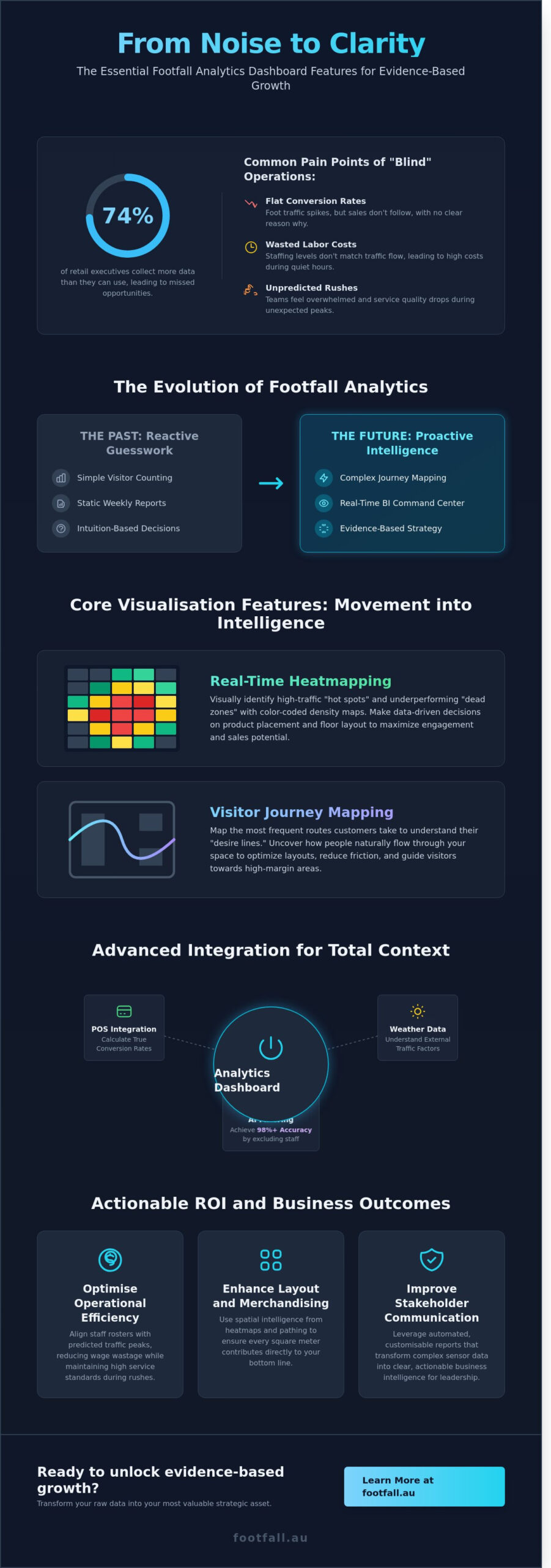
Advanced Integration: Contextualising Your Footfall Data
Raw numbers provide a baseline; they don’t tell the whole story. To unlock the true potential of your physical space, you need context. Modern footfall analytics dashboard features now focus on integrating disparate data streams to create a single source of truth. This moves beyond simply counting heads and begins to decode consumer intent by merging behavioral data with operational realities. When you understand why people enter your store, you gain the power to influence their journey.
- POS integration: This represents the holy grail of retail metrics. By syncing transaction data, you calculate your true sales conversion rate in real time rather than relying on delayed reports.
- Staff exclusion: Accuracy is paramount for data integrity. AI-driven sensors distinguish between customers and employees, ensuring your data reflects genuine shoppers rather than your team’s movements.
- Multi-site comparison: Benchmarking performance across a national network allows you to identify top-performing locations. You can then isolate the variables that drive their success and replicate them elsewhere.
The Power of Sales Conversion Tracking
The dashboard merges transaction timestamps with traffic peaks automatically. This eliminates the manual labor of cross-referencing spreadsheets and significantly reduces human error. Identifying stores with high traffic but low conversion rates helps you pinpoint specific training needs or merchandising flaws. If a store in Manchester sees a 15% increase in visitors but a 4% drop in sales, the issue isn’t marketing; it’s the in-store experience. You can set automated alerts to trigger when a store’s conversion rate drops 5% below its 30-day rolling average. This enables immediate intervention before a trend becomes a permanent deficit.
External Data Overlays
Using API integrations to pull in local weather data and public holiday calendars provides a fair lens for performance reviews. You shouldn’t penalize a manager for a 22% traffic dip during a localized storm or a regional transit strike. Correlating traffic fluctuations with external events builds a more accurate performance model. Historical patterns from 2024 show that a 5-degree temperature drop can increase footfall in indoor shopping centers by 12%. These footfall analytics dashboard features empower you to plan future inventory and staffing levels based on evidence. By looking at a three-year history of weather-to-traffic correlations, you can predict stock requirements for the next season with 90% higher accuracy than guessing based on last year’s sales alone.
Actionable Guidance: Using Dashboard Features to Drive Operational ROI
Data loses its value if it doesn’t trigger a specific business action. Modern footfall analytics dashboard features transform passive observation into active management by highlighting exactly where operational leaks occur. By integrating real-time visitor counts with labor and sales data, retailers can move away from “gut feel” decisions and adopt a strategy of evidence-based optimization.
Data-Driven Staffing Strategies
Aligning staff rosters with actual visitor demand is the most direct way to protect your bottom line. The “Power Hour” report identifies specific 60-minute windows where visitor volume surges, often revealing moments when you’re understaffed and losing potential sales. Conversely, the dashboard highlights documented low-traffic periods, such as the 9:00 AM Monday window, where trimming a single shift can reduce monthly wage wastage by 12%.
The Staffing Efficiency Ratio is a key dashboard KPI that measures the volume of labor hours utilized relative to total visitor traffic to ensure human capital is deployed with maximum precision. Using these insights, managers can create rosters that mirror the rhythmic peaks of their specific location.
- Predictive Rostering: Leverage AI to forecast next week’s traffic with 94% confidence based on three years of historical patterns and local event calendars.
- Real-Time Queue Alerts: Set automated notifications to trigger when dwell times in checkout zones exceed 4 minutes, allowing floor leads to open extra registers before customer frustration peaks.
Validating Marketing Spend
Marketing budgets are often the first to be cut when ROI is unclear. Sophisticated footfall analytics dashboard features provide the “Attraction Rate”—the percentage of passers-by who actually enter the store—to quantify the success of physical and digital campaigns. For example, a 2025 case study showed that high-contrast window displays increased attraction rates by 7% compared to traditional static posters.
Dashboards allow for rapid A/B testing of store entrance layouts. By monitoring real-time feedback, teams can see how a change in the “decompression zone” affects the visitor journey within minutes. This immediate data loop proves the value of national campaigns by tracking the footfall lift in the 48 hours following a digital ad blast. You can optimise your operational strategy by connecting these marketing metrics directly to your conversion data, ensuring every dollar spent translates into a physical visitor.
Using predictive analytics, businesses can now anticipate traffic fluctuations caused by external factors like weather or transit delays. This forward-thinking approach ensures that your store is always prepared, never overstaffed, and consistently positioned to capture every revenue opportunity.
The FootfallCam V9 Advantage: Professional Analytics for Australian Business
The FootfallCam V9 Software transforms raw visitor counts into a strategic asset through a sophisticated, user-centric interface. It’s designed for the rigours of the 2026 retail landscape, where data speed and accuracy determine market leadership. A standout benefit for Australian enterprises is the perpetual license model. Unlike traditional SaaS platforms that demand recurring monthly payments, this model ensures long-term data ownership. It eliminates the risk of losing access to historical trends due to subscription lapses, providing a stable foundation for multi-year strategic planning.
Efficiency is built into the core of the system through customisable, automated reporting. You can configure the software to generate and distribute PDF reports to stakeholders and regional managers on a daily, weekly, or monthly schedule. This automation ensures that 100% of your leadership team remains informed without the need for manual data exports. To maintain the highest levels of accuracy, Footfall Australia support provides local technical assistance. This proximity is critical for ensuring 99.9% system uptime and resolving hardware queries within local business hours, protecting the integrity of your investment.
User-Centric UI and Accessibility
The V9 interface prioritises clarity through drag-and-drop widget functionality. You can personalise your view by selecting the footfall analytics dashboard features that align with your specific KPIs, such as live occupancy or entrance counts. For managers overseeing multiple sites, the mobile app provides real-time accessibility while on the move. Role-based access ensures data security by filtering information; a Store Manager sees granular daily shifts, while the CEO accesses high-level national trends. This structure prevents information overload and keeps every team member focused on their relevant targets.
Scalability for National Growth
The V9 platform handles expansion with technical precision. It scales seamlessly from a single pilot store to a network of five hundred national outlets without compromising processing speed. Centralised management tools allow your IT team to push firmware updates and monitor device health across the entire fleet from one screen. This proactive monitoring identifies potential issues before they impact data collection, ensuring consistent performance across all territories. If you’re ready to transition from guesswork to evidence-based management, consult with a Footfall Australia expert to customise your analytics dashboard today.
Strategic Intelligence for the 2026 Retail Landscape
Success in the physical retail sector no longer relies on intuition. By 2026, the competitive edge will belong to those who transform raw movement into actionable strategy. Effective footfall analytics dashboard features provide this bridge, turning complex visitor journeys into clear metrics like dwell time and conversion rates. We’ve seen how integrating spatial data with local context allows for precise staffing and inventory adjustments that directly impact your bottom line.
Footfall has been a trusted partner for Australian retailers since 2004, providing the technical foundation needed for evidence-based management. Our systems deliver a guaranteed counting accuracy of 98% or higher, ensuring your strategic decisions rest on a bedrock of reliable data. We complement this precision with dedicated local Australian support and comprehensive maintenance plans to keep your operations running at peak efficiency. It’s time to replace guesswork with a system designed for the future of commerce.
Optimise your business with a professional FootfallCam V9 Dashboard today. Your data is ready to tell a story; we give you the tools to read it and the confidence to act.
Frequently Asked Questions
What are the most important features in a footfall analytics dashboard?
Real-time traffic monitoring, heatmaps, and predictive AI forecasting are the most critical components for modern retail success. These footfall analytics dashboard features provide the visibility needed to manage store capacity and staff allocation with precision. High-performing systems use 3D stereoscopic sensors to achieve 98% accuracy in counting, ensuring that every decision you make is backed by reliable evidence rather than estimates.
Can I integrate my existing POS system with a footfall dashboard?
You can seamlessly integrate your Point of Sale (POS) system to unlock vital conversion rate metrics. By syncing transaction data with visitor counts, you’ll calculate the exact percentage of visitors who make a purchase. This integration allows managers to identify why a store with 500 daily visitors might only see a 10% conversion rate while a neighboring branch achieves 15%.
Is it possible to track staff movement separately from customers?
Advanced sensors use employee exclusion technology to separate staff movements from customer data. Using BLE tags or AI-based height and shape recognition, the system filters out employees who pass through entrances 15 or more times a day. This ensures your conversion rates and dwell times remain accurate and aren’t skewed by the repetitive movements of your internal team members.
How does a footfall dashboard help in reducing operational costs?
A dashboard reduces costs by aligning staff schedules with actual visitor peaks identified in historical data. Retailers often see a 15% reduction in labor waste by adjusting shift patterns to match traffic trends from the previous 6 months. Precise data prevents overstaffing during quiet Tuesday mornings and ensures you have enough coverage during high-traffic Saturday afternoon surges.
Can I access my footfall data remotely on a mobile device?
You can access your analytics through secure, cloud-based mobile applications and responsive web interfaces at any time. Modern platforms provide push notifications for specific triggers, such as when occupancy reaches 85% of a building’s legal limit. This mobility ensures that regional managers can oversee 50 different locations from a single smartphone without needing to be physically present on-site.
What is the difference between raw traffic counts and actionable footfall insights?
Raw traffic counts are simple tallies of people entering a space, while actionable insights explain the behavior behind the movement. Actionable insights link footfall analytics dashboard features like dwell time and path analysis to specific business outcomes. For example, knowing 300 people entered is a count; knowing they spent 14 minutes in the electronics zone without purchasing is an insight.
How secure is the data stored within a footfall analytics platform?
Data security relies on end-to-end encryption and strict adherence to global privacy standards like GDPR. Leading platforms use anonymization techniques that process video locally on the sensor, so no personally identifiable information reaches the cloud. This edge-computing approach ensures that 100% of the stored data is anonymous metadata, protecting both your business and your visitors’ privacy.
How often is the data updated on the dashboard?
Most professional dashboards update in real-time, with data refreshing every 30 to 60 seconds. This low latency allows for immediate operational adjustments, such as opening a new checkout lane when queue lengths exceed 4 people. Historical reports typically aggregate this data into hourly and daily views, allowing you to track performance trends over a 24-month period.